Make a Logo Animation in 3 Minutes
Use our logo animation maker to easily animate your logo in just a few clicks!
If you follow recent statistics, you probably know that the popularity of animated logos in videos is growing massively.
It seems that everybody is now using logo animations in videos, websites, corporate videos, television, promoting their company, service or product in a visually dynamic way to start or end their corporate videos.
No surprise, as our eyes are trained to catch things in motion much faster than static visuals.
Fastest logo animation maker
for brands and businesses
But how can I animate my logo without spending hundreds of dollars many people ask.
With Introbrand, you can easily create your own custom logo animation video by uploading your logo directly in your browser and have your final animation video ready for downloading in just 3 minutes.
Our online logo animation maker is very easy to use for everybody. In just a few clicks, it automatically produces professional looking animation videos that will make your small business, institution, company or startup look polished, modern and professional in the age of video.
What a logo animation can do for your business
- Raise brand awareness
With a professionally animated logo you create a strong and memorable image for your brand. Animation will bring your logo to life and create a strong connection with your audience and potential clients in seconds.
- A professional and modern look
Having an animated logo for your corporate, product or website videos will add a sense of consistency and professionalism to your online presence. In fact, it can even give a professional flavor to any simple video or post and make it look like a valuable production.
- Support your brand story
Animated logos connect emotionally with the audience through the powerful combination of image, sound and motion. Animation conveys the vibe of your business 900% more efficient than a static image or any other media.
- It's a one-time investment that pays off
Marketing often includes short-term trends that come and go. Investing in a professional-looking animated logo is a long-term investment. Buy once and use it forever in your videos.
Create your logo animation
online in 3 minutes
Our logo animation maker is simple to use. Just select one of our best-in-class template animations, add a logo, and follow the customization steps. Adjust colors, music and click the -Create Preview- button. You can try as many free animation previews until you're happy with the result.
If you like to purchase professional resolution, your final animation is ready for download in under 3 minutes and comes with an unlimited commercial license, so you can immediately add it to your videos, website, or share it across your social media channels without any restrictions. All our animations are available in 30fps (frames per second) for smoothest video results.
How to use our
logo animation maker
Use your animated logo
to grow your brand
-
Logo opener and ending logos for videos
Animated logos leave a memorable impression. Use them to identify and promote your brand in your own business or marketing videos by adding your animated logo either at the end or at the beginning of each video your release to public or internal communication.
-
Business logo animation and video productions
Any audiovisual production needs a clear visual voice. Use logo animations at the start or end of your video, or in-between as a quick bumper. It will give your videos a more structured feel and dramatically extend watch time.
-
Animated Logo for products and e-commerce
Filming and editing a video about your products is just the first step. Add your business logo animation to the end of all product movies. This looks so much more appealing than a plain video and you literally brand your company name to the viewers’ minds.
-
Video Ads with your company logo
Ever noticed the 3-second logo animation that occasionally shows up in-between different videos? You can do the same with short video ads of 5 seconds, showing off your animated logo! These are super effective, and people won't skip them because they are so short and sweet, excellent way to show off your logo and create a connection with viewers.
-
Company logo animation website films
Add your new logo animation to your business videos or explainer videos on your website to impress your clients with a dynamic and professional look.
-
Social media logo animation
All social platforms are now promoting video media, as prices for ads and sponsoring video posts are extremely affordable. Be it TikTok, Facebook, Instagram, LinkedIn or on X, posting a short animated logo in the newsfeed will show your brand to billions of social media users.
-
YouTube logo animation
Logo animations will make your business YouTube channel and videos stand out from the hodgepodge of amateurish videos. The logo animation is the centerpiece of any video branding. It identifies you and your channel and leaves a memorable impression.
Examples created with our logo animation maker
Corporate Logo Animation
The universal look of this corporate animation is a great choice for a variety of production purposes. Branding your corporate films with this clean animation is a strong statement for any business and will make you look like a serious player in your industry. Use this simple and powerful corporate animation for all your videos and ads.
3D Animated Logo
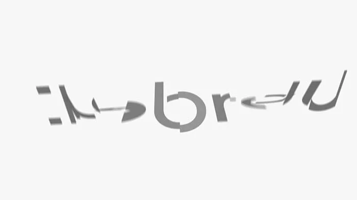
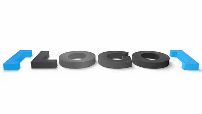
Bring clarity and light to your brand with this 3D animation logo made of shiny and clean 3D materials. Clean white background and minimalistic animation will be a true treat to watch and an invite to your viewers to expect new and original content.
Make this 3D Animated Logo Now
Simple Animated Logo
Add energy to your videos or channel with a clean animated opener inspired by Dub music. The echo effect and dubbing of forms transform this animation into a powerful and yet visually minimalist animation that can perfectly fit any purpose.
Text Animation Logo
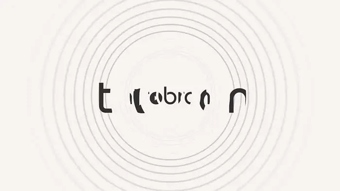
Powerfully revealing logo or text from digital blocks, this text animation is reminiscent of transmitting data, digital worlds and speed. Quick and upbeat, it is a perfect choice if you don’t have estate for lengthy motion graphics.
Logo Animation Ripline
You’ll have your film productions identified and branded with the simple and quick 3 seconds animation. Simplicity and motion is all that is needed to capture the attention of new customers. Get it right from the start and let this animated piece inspired by an abstract line work its branding magic for your company.
How to make a logo animation or animated logo
1. Prepare Your Logo
For best results with our animation maker, the logo should be a PNG file with transparent background (no background color). Don't have a logo? You can also enter text in our animated logo templates, or head over to Canva.com, or check our blog post about the best logo makers.
2. Select a Template
Pick a design that best suits your brand's tone and voice. Most successful businesses (think of Apple, Google and Amazon) use neutral or white backgrounds and short but effective animations. This works for almost any kind of business. By the way, we fully manage your original logo colors to make sure your logo looks 100% correct in the video.
3. Upload Logo to Introbrand
Once you have your logo ready on your computer, just upload it to our animation maker. The logo will be displayed over the template’s background, you just define its size, the rest goes automatically. It's that easy to make a logo animation with Introbrand.
4. Personalize Colors & Music
Make sure your logo has a good contrast to the background (clearly readable). If not, go back to any graphic software to change your logo or choose another template with a more suitable background for your logo, add optional slogan and music. Overall colors are easily altered with the main color slider and there is a great selection of free music and jingles to choose from.
5. Preview & Export
Just click on the Create Preview button and let Introbrand do its magic. Our system will ask you to sign up with your name and email in order to create a free personalized preview, no worries we don't spam. If you like the preview animation, you can export, license and download it at super affordable prices and use it forever in any media including TV and web.
Go to Introbrand Start Page
