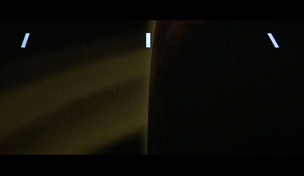
Which film title designs stayed in your memory over the years? From the static sharp letters of the greenish hell of Dr. Caligari to the false serenity of space in Alien, film title design always aimed to intrigue the viewers right from the start.
In this post, we bring you some of the most innovative, original, visually engaging, and technologically advanced film title designs that made history.

Film title design in the past
Its development started with the early silent cinema when titles were nothing more than the cards with text written on them that were photographed and edited into a film, over the first film title sequences that included motion graphic, to contemporary masterpieces.
Now we turn to examine which film title designs made history. They are usually the most memorable ones. Each of the following film title designs has brought something new into the world of film titles and sequences. They also often paid a tribute to the designs from the past and broke the boundaries of the media.
Humorous Phases of Funny Faces (1906)
Directed by J. Stuart Blackton, this film is not just one of the first animated films, but is also the first one with the animated opening sequence. Created in 1906, this short animation can be considered an early precursor of the title sequences that became the trend in the second half of the 20th century.
Das Kabinett des Doktor Caligari (1920)
Influenced by the Expressionist art and especially by the German Expressionism, the opening title for Dr Caligari uses sharp linear forms resembling broken glass to evoke the psychological turmoil of the main character. Green color and an effective music make this static card design a memorable opening for one of the best films in history.
My Man Godfrey (1936)
From the outset of the film history, moviemakers tried to overcome the technological limits in order to offer the most engaging experience to their audiences. The film title design of My Man Godfrey is one of such examples. In times when title cards dominated the domain of opening titles, Gregory La Cava decided to pan a camera over a cityscape showing the names of the cast and crew as illuminated neon lights. In this way, he also marvelously encapsulated the theme of the film.
The Man with the Golden Arm (1955)
How to show a theme of a film – a drug addiction of a jazz musician – without provoking an outrage among the more conservative audiences? In 1955 Saul Bass came with the ingenious idea to use white paper-cut strips on a black background for this purpose. His sequence for The Man with the Golden Arm changed the course of the film title design history, and his style was copied many times over the years. It is one of the most effective sequences, announcing the intensity and chaos of the main character’s life in the film.
Vertigo (1958)
Even if you are not a big Hitchcock fan, you cannot deny that Vertigo is the masterpiece of film art. The film was chosen as the best film of all times by the British Film Institute. And what do you think about its opening sequence by Saul Bass? Martin Scorsese called it “a mini-film within a film” for its depth and stylistic perfection in announcing the story of the film. The sequence also includes a pioneering computer art of spirographic images made by John Whitney.
Dr. No (1962)
The first in the franchise of the James Bond films, Dr. No establishes a standard that will be copied in all the following films – a gun barrel shot and a powerful soundtrack, made without the help of a digital software.
Modern film title design examples
Alien (1979)
Only the second major film project of Richard and Robert Greenberg, the brilliant Alien opening sequence is at the same time serene and foreboding. The disjointed Helvetica letters come together to form the title, but the space between them remains larger than it should be, creating an unsettling sensation in viewers.
Se7en (1995)
This David Fincher’s cop drama introduces us first with the main protagonists – a rookie detective and its retiring partner – and then moves to the opening titles. They push us even deeper into the menacing world of the film. The sequence introduces the main antagonist and the obsessive world he inhabits, setting the tone for this neo-noir film. The letters in this film title design are etched directly into the film tape, adding a sense of horror and graphic violence.
Catch Me if You Can (2002)
Kuntzel + Deygas created a true homage to Saul Bass’ title designs in this Steven Spielberg’s film. The film title design has all the elements of the Hollywood classics with elongated figures, saturated colors and a lively typography, creating a 1960s vibe.
The Girl with the Dragon Tattoo (2011)
With the version of the Immigrant Song blasting in the background, this David Fincher’s film starts with a nightmarish visuals showing CGI of bodies, cables, phoenixes, and fire. It’s a powerful sequence showing organic and technical forms combined in a postmodern visual orgy.
Film title design outlook
From its beginnings, film title design served to evoke the general atmosphere and story of a film. Often provocative and intriguing, film title designs followed the technological advances and developed into an art form over the decades.
So, the next time you go to the cinema don’t be late, as you may miss the next opening sequence that will change the history of this interesting genre!
To know more about this topic and browse recent title designs, check out the website Forget the Film, Watch the Titles.
Posted by: Introbrand
