We cannot miss big brands wherever we go, as their logos grew into the staples of popular culture. An excellent corporate design contributes to this, and we lead you here through its basics.

A good corporate design is one of the essential elements in any brand’s success.
Instead of focusing just on logos, companies often approach corporate design in a more holistic manner, which includes a larger visual positioning of the brand across different media.
“Design plays an essential role in creating and building brands. Design differentiates and embodies the intangibles–emotion, context, and essence—that matter most to consumers.”Moira Cullen, Senior Director, the Hershey Company
Their brands are designed by the branding experts who know how to preserve recognizability of the brand while adding the necessary level of versatility for its application throughout different channels.

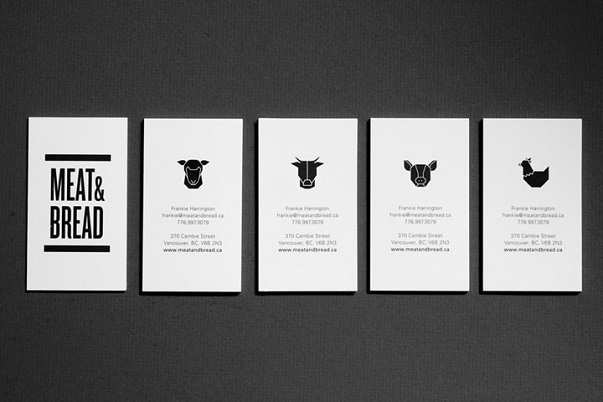
Identity and brand design for Meat & Bread. Designed by Glasfurd & Walker. Image via retaildesignblog.net
6 lessons in corporate design
If you are going for the same visual impact for your own brand, start off by adopting the strategies big companies use to emphasize their presence and increase the visibility of their brand.
Here, we teased out the most essential corporate design basics for you.
1. Design a unique logo or wordmark
Don’t be swayed by trends. Pick the option that can best show the uniqueness of your business.
Some companies prefer to have a logo, while others settle for wordmarks, which convey the equal sense of professionalism.
Think of Coca-Cola – a simple wordmark that works each time.
2. Prepare different brand design variations
While your logo or wordmark must be unique, it should as well be adaptable to different usages and media.
Depending on the media where your logo will appear, you may need a black and white variation, or, what is more important today, a different horizontal, vertical, square, or circular shape variations that can easily be adopted as avatars for different social media.
Ultimately with the rise of online video, your logo should be animated and added as a video intro as the centrepiece of video branding.
3. Be consistent with colors
One of the most important elements for a consistent corporate design is color.
The colors in a logo usually define the whole corporate color palette. The choice of colors should be limited to a few options, with variety added through either texture or color quality style such as warm, cold, pastel or neon.
4. Standardize typographic identity
You should stick to a certain, limited amount of typefaces you use in your marketing materials.
Adding a bit of variety is ok, but always go for complementary typefaces if you are not using the original ones.
Some devices may not be able to show your original typefaces, so having the complementary ones can save you a lot of time and effort. Capitalization of headlines, text formatting, and other editorial decisions add a distinct voice to your brand, so be diligent in preserving the standardized options for this as well.
5. Be consistent with images
While, obviously, you cannot use the same images over and over again, you should at least pay attention to their styles.
Try to pick images that best fit with the ones you’re already using. Soft or sharp focus, color, and style of charts, graphs, and illustrations, are just some of the elements you should keep in mind while choosing the images.
There are docents of online stock photography websites out there where you can find any photo, video or vector graphic, for example Istock or Shutterstock.
6. Create a style guide
All the small details that are part of your corporate design should be collected into a style guide booklet for future reference and use.
You should include textures, colors, line styles, and other elements that are the foundation of a brand in it. It is important to have them in one place as they create your brand’s cohesive identity.
This practice comes from big companies that usually have such a booklet, which is handed out to persons or design studios responsible for a company’s corporate design and identity.

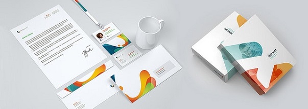
Example of corporate branding on various products. Image via limelight leads@flickr.
Corporate design for pros!
Corporate branding relies on a few simple strategies that can be replicated for any other branding purpose.
Be consistent in your visual design and try to standardize as much of your design as possible - from colors to typography and images. It's also important to prepare the variations of your design for different online channels and social media.
The easiest way to do this is to create a style guide where you will have all the elements of your brand's visual identity.
As we mentioned above, a brand is much more than just a logo. Presenting a consistent visual identity in different media is the first step to success. So go through these elements of corporate design and start branding your print and video productions like a pro!
Featured image via flickr.com
Thank you for reading this article!
Back to Introbrand
