Each year designers offer us trends to follow, from 80s aesthetics to Sci-Fi futurism and even Victorian Steampunk style. Motion graphics often takes its cue from these trends.

In the last few seasons we saw flat visuals taking the center stage, so we investigated what characterizes this style and what makes it so popular today.
Origins of flat motion graphics
In times when Jackson Pollock was making his action paintings with a free application of dripping paint, creating a mishmash of abstract shapes and colors, a group of artists decided that it was time to clear up the artistic act.
Their goal was to bring clear and solid forms back into the focus of the artistic scene.
The 1960s were just starting as was the Minimalist art movement. However, minimalism as an aesthetic principle is not exclusively linked to the art from this period. Some examples of De Stijl art can also fit into this category as well as the works of the Suprematist Kasimir Malevich.
Architectural works of Mies Van der Rohe and the traditional Japanese designs are also considered this Zen-like style in their aesthetics.
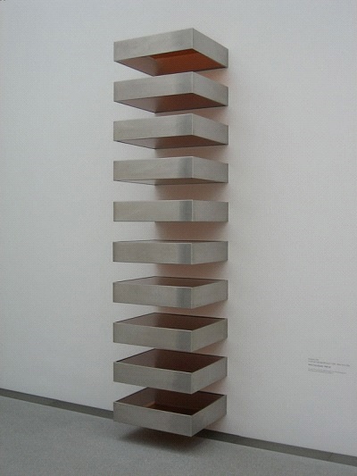
Minimalism in art is a part of the broader Abstract art style, reduced to the essential geometric forms and extreme simplicity. In sculpture, it is characterized by the use of industrial materials, hard-edged forms and often the use of just one color.

Features of flat motion graphics
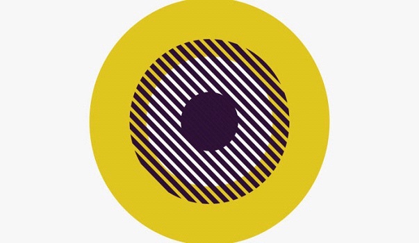
Taking their cues from art, motion graphic designers also adopted minimalistic styles in flat motion graphics that limits the expression to the clean backgrounds, geometric forms, and crisp lines.
Instead of going for the wow effect with opulent images, sweeping visuals, and richness of colors and textures, designers sought the same effect with the simple but yet highly effective combination of the formally-reduced features and elements.
The core features and elements of flat motion graphics include:
- Flat textures and patterns
- Monochromatic or limited color palette
- Maximized negative or white space
- Small or thin typography
What also characterizes this style is the restrictive use of graphic features such as lines, graphics, images, fonts, and textures.
Why is flat design so popular nowadays?
Imagine yourself walking on a busy street surrounded by billboards with flickering logo animations, commercial posters in shop windows, and the general visual noise of a big city. With the world rushing around you, what will attract your gaze?
This is one of the reasons why flat motion graphics are favored by so many designers. In an environment polluted by visuals, clean and uncluttered design will grab more attention.
But this is not all.
Simple or flat design follows a function, is visually uncluttered and with the focus on the message, with all the possible distractive elements removed.
It is also simpler to get it digitally coded and is faster to load. Finally, it is timeless, so it will never go out of fashion or be considered as outdated.
If you are thinking where to start when it comes to the style of your brand or channel, going for simple and clean animations will be a winning choice.
Flat style – the current ruler of motion graphics design
Today, clean and flat are of the dominant styles not just in art or motion and video design, but also in web design, furniture industry, and fashion.
The simplicity of forms, focus on the content, timelessness, attention-grabbing quality, visual clarity, and simplicity, add to the status and fame of this style in online and offline world.
Image: Donald Judd, Untitled, 1968-9. Photo Oliver Kurmis via Flickr.
External links: http://www.visual-arts-cork.com/history-of-art/minimalism.htm
Thank you for reading this article!
Back to Introbrand
